Rank Your Preferences for an Alternative Nail Color
If your reference shade is unavailable, rank color family, depth and finish. Use a clear example to discuss alternatives and confirm your choice with YLG.
Leer en español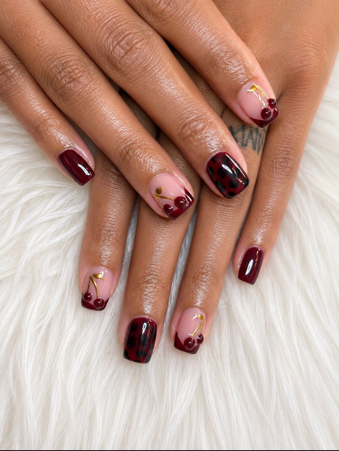
A reference photograph can give you a favorite nail color without guaranteeing that the exact shade will be available for your appointment. Preparing an alternative is easier when you decide which feature matters most. Instead of asking for anything “close enough,” rank the color family, its light or dark appearance, and the finish you want to discuss.
Rank three features of your reference
Choose one color area in the photograph and describe it in everyday words. For a burgundy reference, your notes might say “red rather than purple,” “quite dark,” and “glossy.” Those observations describe what you see; they do not identify a product or shade code.
Now put those features in order. There is no universal correct ranking. One person may care most about keeping the red family, while another would rather preserve the darkness even if the color shifts. Write the order before looking at alternatives so each new option does not silently change the goal.
Use a ranked example to explain the tradeoff
Imagine this personal preference list:
- First, keep the color in a red family.
- Second, keep a dark appearance, with some flexibility toward a slightly lighter red.
- Third, discuss the glossy finish separately once a suitable color option is identified.
For that ranking, you might prefer discussing a somewhat lighter red before a similarly dark purple. Someone who ranks darkness first could reach the opposite decision. These are hypothetical comparisons, not a description of shades in stock at YLG or a promise that a particular finish is available with every service.
Include one clear limit
Say which change would make the alternative feel too different. For example: “I can consider a lighter red, but I do not want a purple-looking result.” A useful limit narrows the discussion without requiring the studio to guess what “similar” means to you.
If you are unsure, leave the limit as a question and ask to compare suitable options if samples are available. Consider them together under the same viewing conditions. A screen image alone cannot confirm an exact match to a physical color.
Confirm the alternative before proceeding
Your short request could be: “If this exact shade is unavailable, keeping the red family is my priority. I can consider slightly lighter options. Please show me what fits the service before we settle on the color.” Check the proposed alternative yourself rather than treating your ranking as automatic approval of any substitute.
The YLG cover photo shows burgundy and pink areas, cherry details, dark patterned marks, and gold-colored accents. It is a visual reference, not a current shade inventory. You can use just one color from it without requesting all its decorations.
Review YLG's current services and use the contact page to clarify your request. Once the service is clear, reserve your appointment and keep your ranked color note with the reference.