Turn Nail Inspiration Photos into One Clear Design Brief
Give each nail reference a purpose, choose the details that matter, and combine several inspiration photos into one clear written design brief.
Leer en español
A folder full of nail inspiration can contain several good ideas and still leave one important question unanswered: what should this particular set look like? The useful next step is to turn the collection into a short design brief. Each image gets a job, and the written note explains which details matter when the images disagree.
Cover image: an AI-generated illustration, not a photograph of work performed at YLG.
Give each reference one job
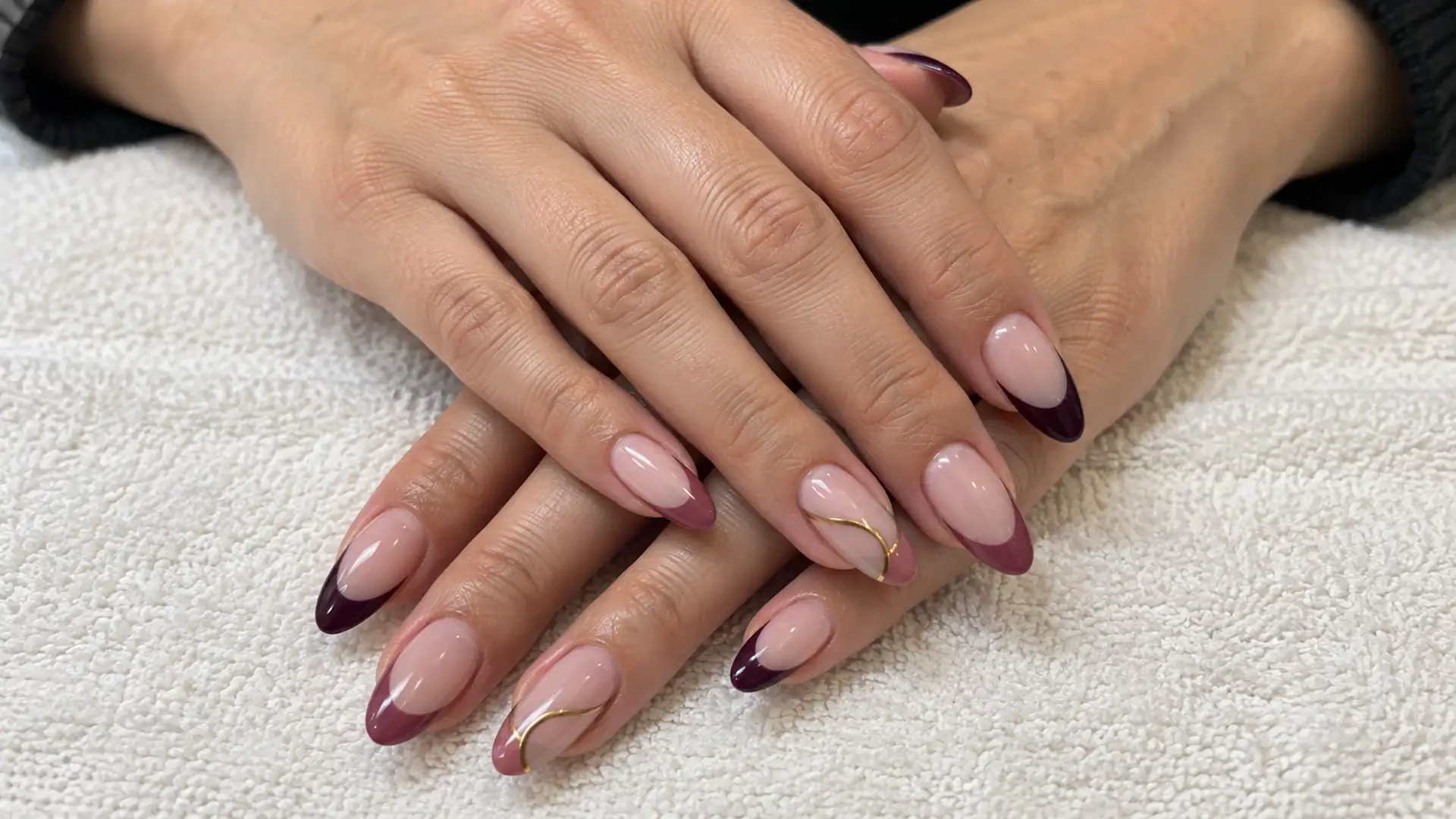
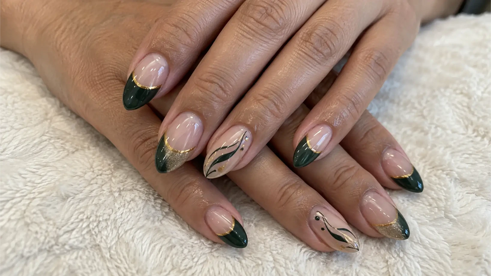
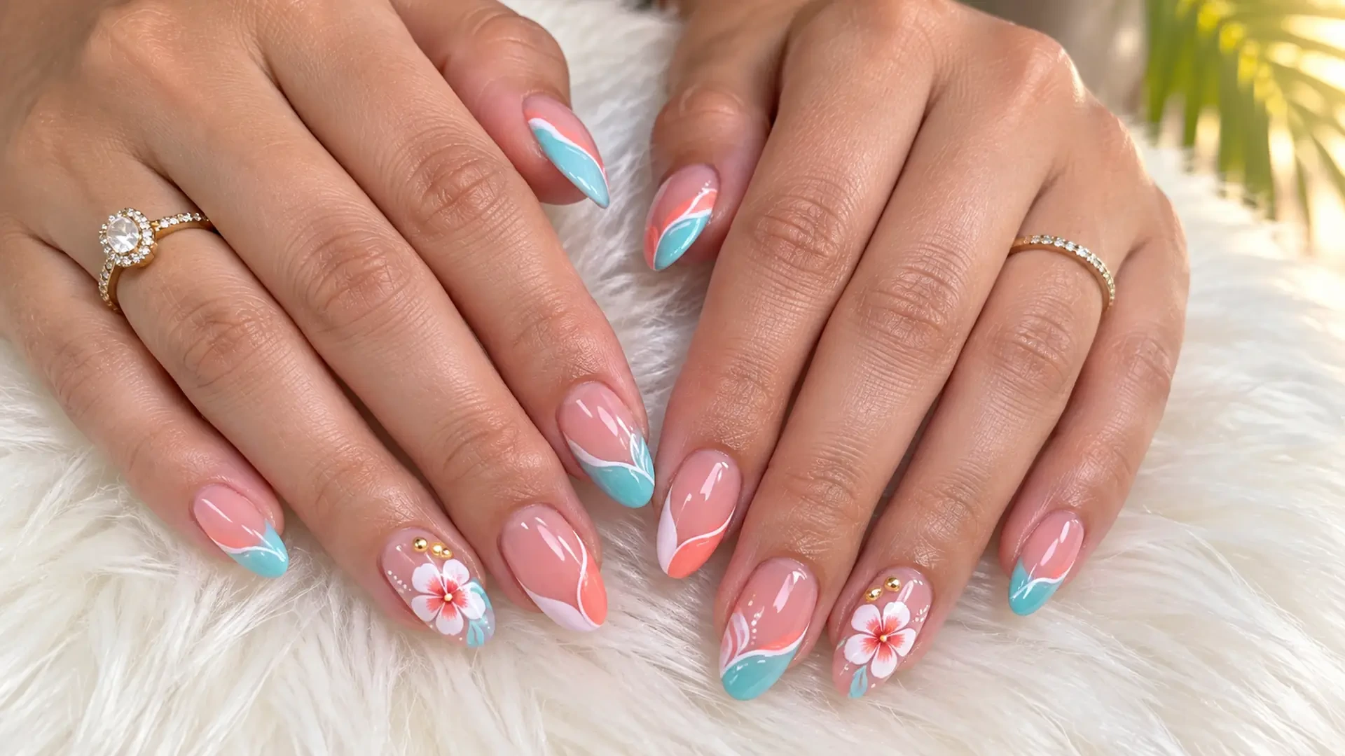
Choose up to three main images. Label the first for its color relationship, the second for its pattern or motif, and the third for its placement. A photograph can help with more than one decision, but naming its main purpose keeps an attractive background, pose, or accessory from becoming an accidental instruction.
Write what you mean in ordinary words: “the deep red beside the soft pink,” “one small flower,” or “decoration near the tip.” If you like only the flower in a picture, say so. You do not need to identify the product or technique used to explain the visual result you want.
Separate essentials from flexible details
Make two short lists. Essentials are the features that would make the design feel like yours. Flexible details can change after discussion with the technician. Keep the essential list small enough that it expresses a clear direction rather than every detail from every photograph.
- Essential: a quiet pink base, a burgundy accent, and a small floral focal point.
- Flexible: the exact flower shape, which finger carries it, and whether the remaining nails have tips or solid color.
- Leave out: lettering and the extra pattern visible in the second reference.
The “leave out” line is particularly useful when a reference contains several strong elements. It tells the technician that the image is a selection of ideas, not a request to reproduce everything in it.
Resolve one conflict before adding another image
Suppose one photo has very full decoration and another has large clear areas. Decide which feeling should lead. You might write, “Use the flower idea from photo two, but keep the open space of photo one.” That sentence is more actionable than adding a fourth image that sits somewhere between them.
If two colors compete, name a lead and a supporting color. If two motifs compete, choose one for this visit and save the other. This does not remove creativity; it gives the conversation a starting point.
A brief you can actually show
Soft pink is the main color. Use burgundy as the supporting color. I like the small flower in photo two, with the clear space shown in photo one. Please leave out lettering. The flower placement is flexible; I would like to discuss what fits the finished nail size.
Keep the labeled images beside this paragraph in one phone note. The technician can see the source and your interpretation together, without guessing which part of a large inspiration board matters.
Check the brief, then discuss execution
- Can you point to the role of every image?
- Is the main color clear?
- Have you named the one detail you most want to keep?
- Have you marked anything that should be omitted?
- Is there room to adapt the idea with the salon?
You can find visual references in the YLG home gallery. These planning suggestions are original editorial options, not a fixed collection of offered designs. Confirm the specific execution when arranging your visit through the booking page.
Service source: Consult the current YLG service catalog for service information.