Compare One Nail-Color Sample in Two Lighting Settings
Use the same physical color sample in two everyday lighting settings. Record what you notice and bring a clear preference to your YLG nail consultation.
Leer en español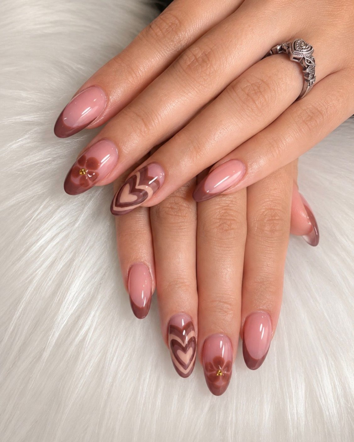
A nail-color reference may look appealing in one setting and leave you unsure in another. If you can examine a suitable physical sample, try describing how that same sample looks in two everyday settings. The goal is to identify a preference you can explain to your nail artist, without treating a photograph as an exact shade match.
Keep one physical sample as your starting point
Choose one sample that is available for you to inspect, such as a color card you own. At the studio, ask before moving or handling a display sample. Keep its name or label with your notes so you do not accidentally compare two different colors.
Changing the light can change an object's apparent color, and viewing angle also matters. Konica Minolta's visual-evaluation guidance explains these variables. For a simple personal comparison, keep the sample, background, and viewing angle as consistent as practical while changing the lighting setting.
Name the two settings in your notes
You might compare the sample near a window during the day and in a room lit by your usual lamp. Write those descriptions down instead of labeling one view “true color” and the other “wrong.” This informal exercise is for discussing what you like; it is not a standardized color test.
Use two short entries:
- Setting A: where you looked, what you noticed, and whether you liked it.
- Setting B: the second location, what you noticed, and whether your preference changed.
If the sample looks similar to you in both settings, record that too. You do not need to discover a dramatic difference for the comparison to be useful.
Describe an observation before requesting a change
A hypothetical note might read: “By the window I notice more pink; under my lamp it seems browner. I prefer the pink impression.” Keep that separate from the next question: “Could we discuss available options with that preference in mind?”
Your observation does not identify the product in an inspiration image or prove how a different shade will behave. If you only have a screen reference, say so and ask whether a suitable physical comparison is possible. Do not assume the studio has a particular sample or viewing setup.
Bring the comparison, not just the preferred picture
Share both notes, the sample label if known, and the feature you want to discuss. The YLG cover photograph shows pink and cocoa-toned details with hearts and flowers. It offers color inspiration, not two views of the same manicure under different lights.
Review the current YLG services and use the contact page for questions. Confirm the service and design possibilities, then reserve your visit.