Give Three Nail Colors Different Amounts of Space
Compare two versions of a three-color nail palette by swapping the largest and smaller color areas while keeping one small accent for your YLG design.
Leer en español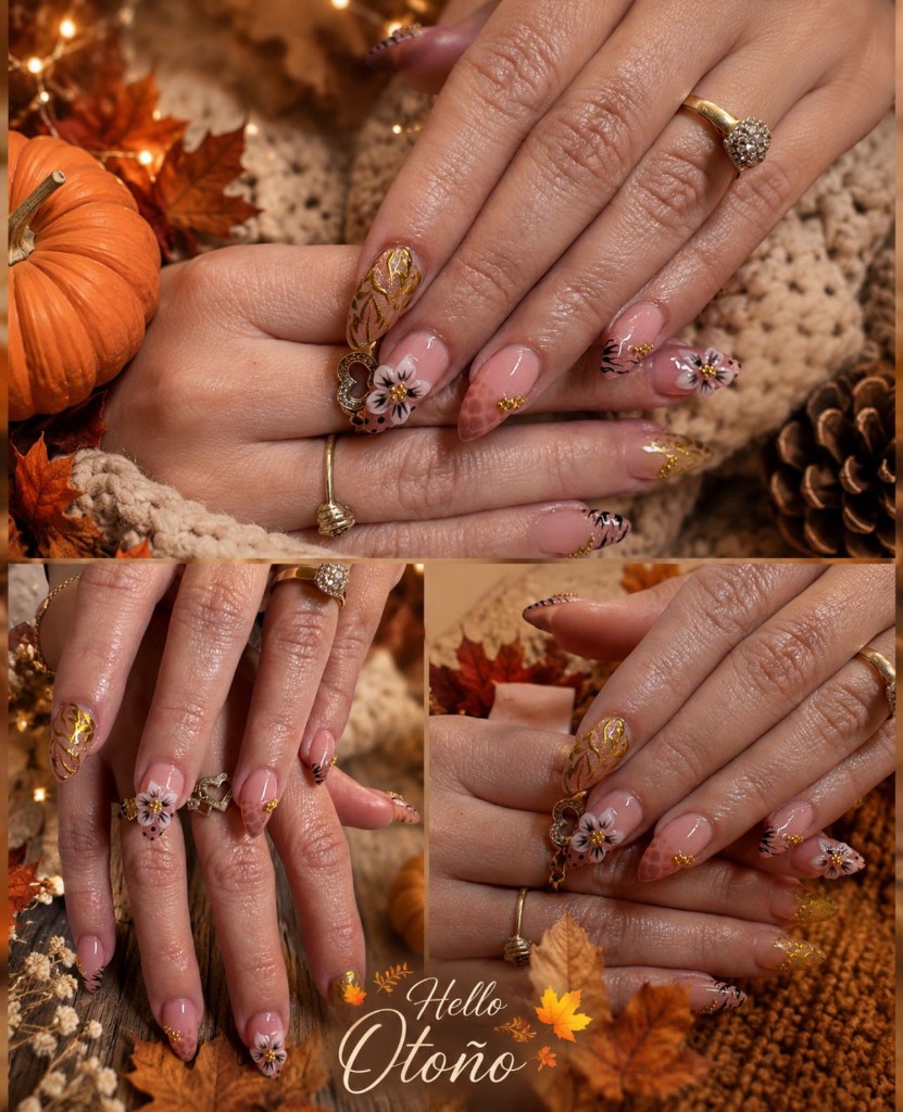
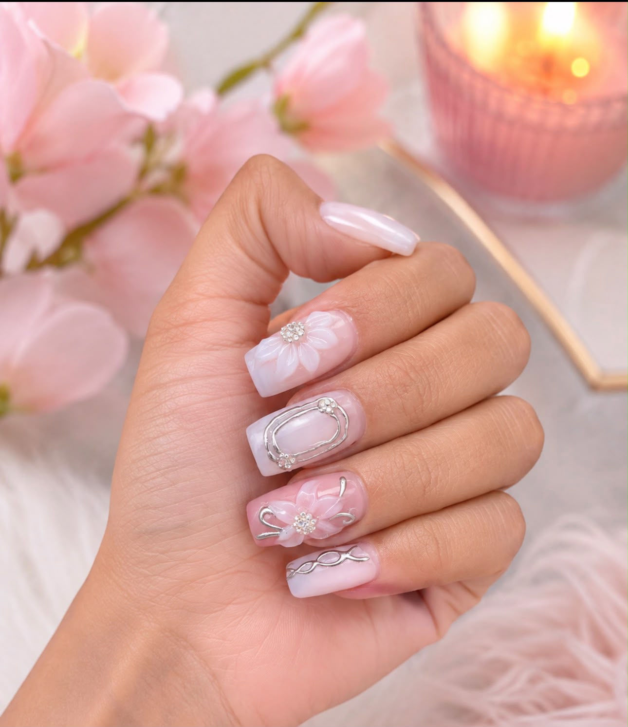
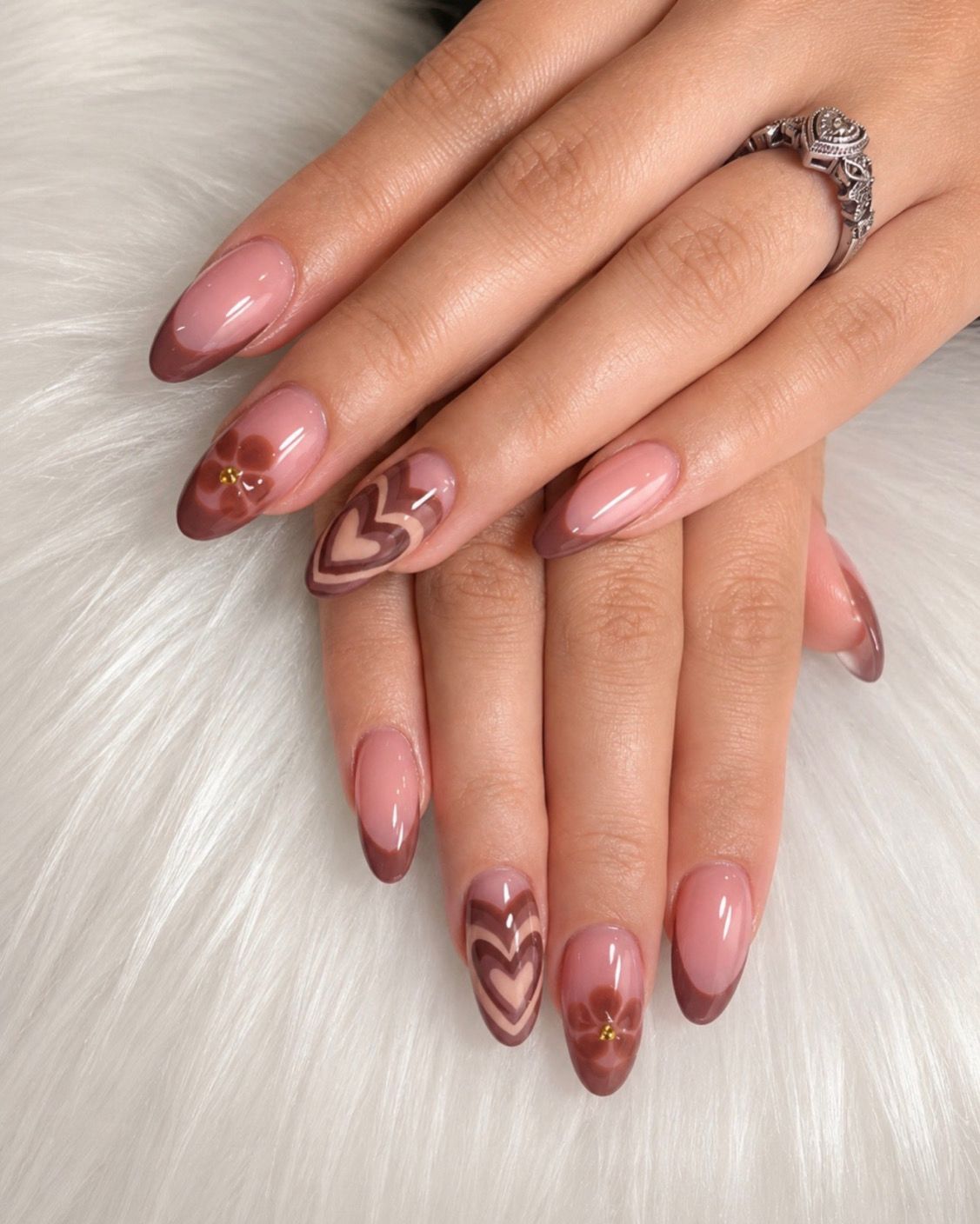
Choosing three colors does not decide how much of each one will appear in your manicure. Pink, terracotta and gold-colored details can be arranged with mostly pink showing, or with terracotta taking the largest area. Compare those proportions before adding more shades to the idea.
Give each color a size role
Write your three colors down and assign each one a role in the sketch:
- Largest area: the color you want to see across most of the design.
- Smaller area: a second color that remains clearly visible.
- Small detail: a third color reserved for limited marks or accents.
These labels describe space, not which color must attract the most attention. A tiny bright detail may still be the feature you notice first. You also do not need to give each color an equal share simply because you like all three.
Compare two color cards before planning fingers
Draw two rectangles of the same size on paper. On the first, give pink the largest area, terracotta a smaller area and a gold-colored mark the smallest area. On the second, exchange the pink and terracotta areas while keeping the small gold-colored detail.
Keep the three chosen shades as similar as possible between cards. That way, the comparison asks one question: which color do you prefer to see more of? The cards are a rough visual exercise, not a nail layout or a product recipe.
Check the smallest color separately
Once you choose a card, look at the third color. Would you like it to remain a few small marks, or does it need a larger area to express your idea? If you enlarge it, reduce another area in the sketch and compare again. You can decide the relationship without measuring exact percentages.
The YLG cover collage includes pink-toned bases, warm reddish-brown areas and gold-colored details, along with flowers and dark marks. You can select three colors from that reference without adopting every decoration. The collage illustrates a possible source palette, not the two simplified cards described here.
Turn the comparison into a request
A useful note could say: “Keep pink as the largest color area, terracotta as the second, and gold-colored details small. I prefer that balance to a mostly terracotta version.” If you are undecided, bring both cards and explain which difference you want help comparing.
Ask how the chosen balance could fit your nail length and design. The amount of visible color does not identify a service, material or available technique. Once the palette balance is settled, a ten-finger placement map can help distribute the details.
Review the YLG service catalog, confirm the booking option for your proposed design, and reserve your visit.